
BUSINESS SIGN DESIGN
BUSINESS SIGN DESIGN in Salt Lake City, UT.
Plenty of signs are built well and still fail, because the layout was never tested against the way people actually see it. Design is where that gets decided. M Graphics & Signs Inc provides business sign design in Salt Lake City, UT for companies that want their signage planned before it is priced. Our designers work from your logo, palette, and typeface, then adapt them for distance, speed, glare, and the surface the sign will sit on.
THE TIME TO FIX A SIGN IS BEFORE IT EXISTS.
Once metal is cut, every change becomes a rebuild. So we front-load the thinking: proportion, contrast, negative space, mounting method, and how the layout behaves at 200 feet and at arm's length. Getting those right on screen means the fabrication stage becomes execution rather than problem solving, and the install day holds no surprises.
Revisions here are conversations, not change orders. We expect a few rounds and build them into the schedule, because the version you love on the third pass is the one worth building.
- Concept renderings on photos of your site
- Vector artwork prepared for production
- Color matched to your brand values
- Multiple layout options at every stage
Smoother Daily Operation
A door sized and hung correctly opens and closes without sticking, dragging, or requiring a shoulder to shut. We confirm dimensions and swing direction before ordering so the finished door operates the way it should from day one.
BUSINESS SIGN DESIGN
LEGIBILITY BEATS CLEVERNESS AT 40 MILES PER HOUR.
A layout that looks elegant on a laptop can vanish on a busy road. Thin strokes disappear, tight letter spacing blurs, and low-contrast color pairs turn to gray. Our design work is judged at the distance and speed your customers will actually be traveling, using proof prints and scaled mockups. What survives that test is what we recommend, even when the safer choice is the simpler one.
DESIGNED FOR THE BUILDING YOU ACTUALLY HAVE.
Brick, stucco, glass curtain wall, and corrugated metal each accept signage differently, and each throws light differently once the sun drops behind the Oquirrhs. Our designers work from site photographs and structural notes rather than assumptions, so the concept you approve can be mounted as drawn. That single habit removes most of the friction that appears when a design meets a real wall.
WE HAVE WATCHED PLENTY OF DESIGNS GROW OLD BADLY.
Trends move quickly in graphics and slowly in signage, because a sign hangs for 10 years or more. Since 1999 we have watched which layouts still read as current long after installation and which ones date a business the moment the trend passes. That perspective shapes the advice we give, particularly around color, type weight, and how much detail survives fabrication. What impression do you want your building making in 2036?
WHAT GOOD DESIGN WORK DELIVERS
CLEAR AT A GLANCE
Type sized and spaced for real viewing distance means your name registers in the moment someone looks up. Nothing about the message needs a second pass to decode.
NO EXPENSIVE SURPRISES
Catching a proportion problem or a mounting conflict during design keeps it out of the fabrication stage, where the same fix means new material and a delayed installation date.
A BRAND THAT TRAVELS
Artwork prepared properly once can be reused for vehicles, print, and future locations. Your visual identity stays consistent wherever it appears instead of drifting with each new vendor.
APPROVAL YOU CAN PICTURE
Reviewing a rendering placed on your own storefront removes the guesswork from sign-off. Decision makers see exactly what will be built, so approvals move faster and second-guessing stops.
CODE-READY FROM THE START
A layout drawn inside your zoning limits reaches the permit desk ready to stamp. Fewer corrections mean fewer weeks between the decision to proceed and the sign going up.
MATERIAL DECIDED EARLY
Choosing substrate and finish alongside the layout means the drawing reflects what will actually be built. Texture, sheen, and edge detail stop being afterthoughts settled on the shop floor.
WHAT WE DESIGN
OUR SIGN DESIGN WORK.
Design engagements range from adapting an existing logo for one storefront to building a full signage standard for a growing chain. These are the pieces of that work we handle most often for Salt Lake County clients.
BRAND FOUNDATION
Logo and Brand Development
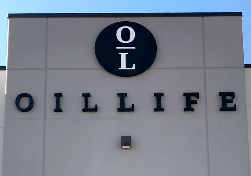
Businesses without usable artwork start here. We refine or rebuild the mark into clean vector form, set color values, and choose typefaces that hold up at sign scale rather than only on a business card.
VISUAL PROOF
Sign Concept Rendering
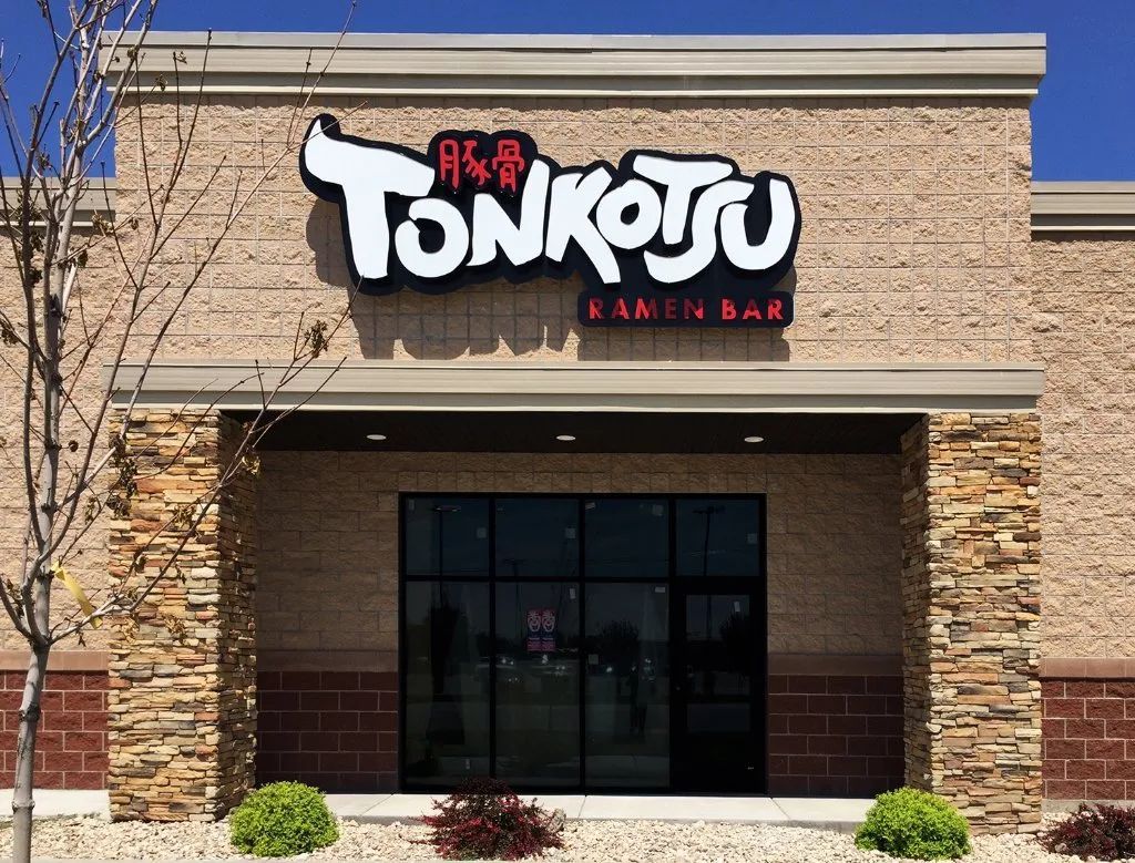
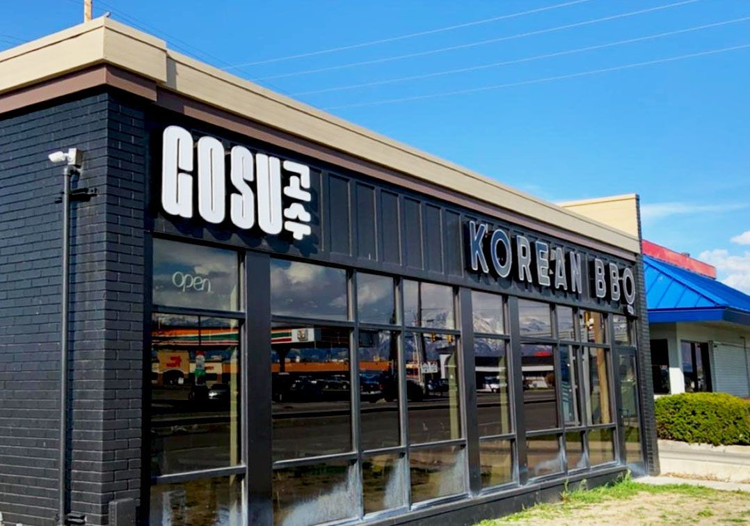
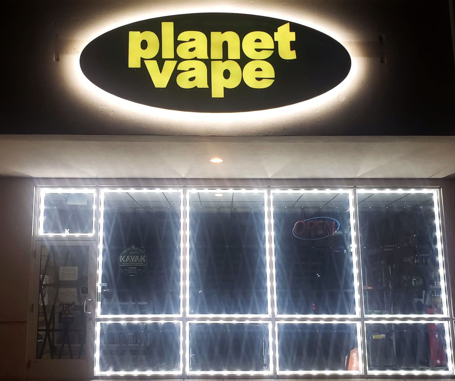
Flat drawings hide problems that photorealistic renderings expose. Seeing depth, shadow, and reflected light on the proposed piece lets everyone judge the real thing rather than an outline on white paper.
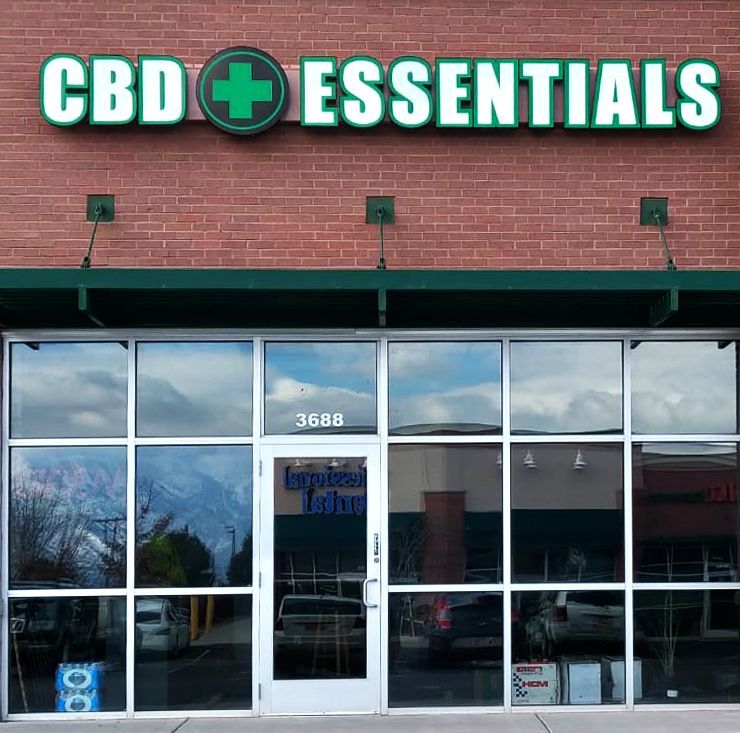
ON LOCATION
Site-Specific Mockups
Photographs of your frontage become the canvas. Placing the proposed sign into that image at true scale answers the question everyone asks first, which is whether the piece will look too large or too small.
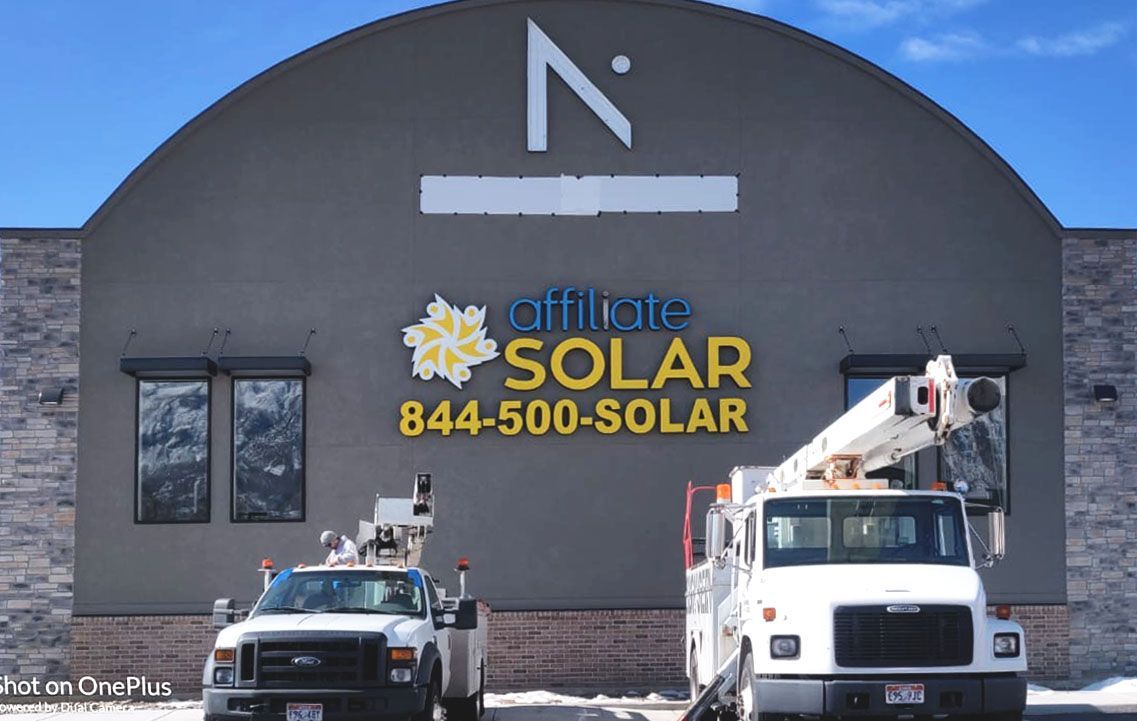
TOUCH AND FEEL
Material and Finish Selection
Brushed aluminum, painted acrylic, matte vinyl, and routed composite all carry a different personality. Samples come to the table during design so the choice is made by looking rather than by reading a specification line.
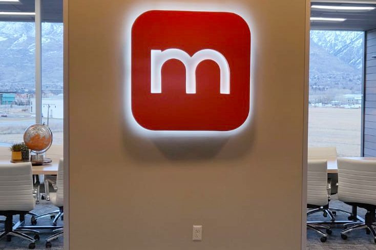
BUILT TO REPEAT
Multi-Location Brand Standards
Growing companies need signage that reproduces exactly at the next address. We document dimensions, colors, materials, and mounting into a standard your future sites can be built from without reinventing anything.
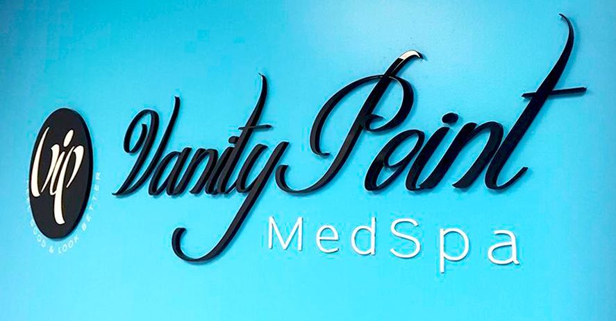
PRODUCTION READY
Design File Preparation
Artwork that prints beautifully can still fail on a router table. We outline fonts, set cut paths, separate layers by process, and hand fabrication a file that needs no interpretation at the machine.
Duis aute irure dolor in reprehenderit in voluptate velit esse cillum dolore eu fugiat nulla pariatur. Excepteur sint occaecat cupidatat non proident, sunt in culpa qui officia deserunt mollit anim id est laborum.
Lorem ipsum dolor sit amet
★★★★★
Mike T.
THE WORD ON OUR WORK
WHAT OUR CLIENTS SAY.
Design is the stage clients tell us they were most nervous about and least prepared for. The feedback we hear afterward tends to land on the same point, which is that seeing the sign on their own building made an intimidating decision feel manageable.
Common Questions
frequently asked
questions.
Design questions come up before anyone talks about materials or permits. These are the ones we field most often from owners about to commission signage for the first time.
What information does a sign designer need to start a project?
Your logo in vector form, brand color values, photographs of the building from each approach, and the dimensions of the space available. If artwork only exists as a low-resolution image, we rebuild it before designing begins.
Will I see a rendering before the sign is built?
Always. Nothing goes into fabrication without your written approval of a rendering showing the sign in position, at scale, with the specified colors and finishes. That drawing becomes both the shop reference and the basis of the permit submission.
What fonts and colors read best from a distance?
Medium to bold weights with open counters stay legible far longer than thin or highly decorative faces. High contrast matters more than the specific hue, which is why dark type on light backgrounds outperforms most other pairings outdoors.
Can you work from an existing logo file?
Yes, provided it can be converted into clean vector paths. Print-ready EPS, AI, or PDF files drop straight into the layout. Web images usually need redrawing, which we handle inside the design stage rather than as separate work.
How does a sign design change for a multi-tenant building?
Shared frontages usually come with a landlord criteria document setting band height, letter size, color range, and mounting method. We design inside those limits first, then adapt your brand to fit rather than discovering the conflict at review.
What is a sign package for a business with several locations?
It is a documented set of drawings, specifications, and artwork covering every sign type a location needs. New sites get built to that record, so M Graphics & Signs Inc can repeat your identity exactly across Salt Lake City, UT.
How is a sign design adapted to fit a building's architecture?
Existing lines govern. Window bands, column spacing, brick courses, and roof edges give a layout its natural boundaries, and a sign that respects them looks planned. Fighting the architecture is what makes signage look stuck on after the fact.
How many design revisions are normal before approval?
Two or three rounds are typical. The first concept opens the conversation, the second responds to your reaction, and the third usually settles it. M Graphics & Signs Inc has followed that rhythm in Salt Lake City, UT since 1999.
Lorem Ipsum has been the industry's standard dummy text ever since the 1500s, when an unknown printer took a galley of type and scrambled it to make a type specimen book. It has survived not only five centuries, but also the leap into electronic typesetting, remaining essentially unchanged.
STEP 03
Lorem Ipsum is simply dummy text.
Lorem Ipsum has been the industry's standard dummy text ever since the 1500s, when an unknown printer took a galley of type and scrambled it to make a type specimen book. It has survived not only five centuries, but also the leap into electronic typesetting, remaining essentially unchanged.
STEP 06
Lorem Ipsum is simply dummy text.
HOW WE WORK
FROM BLANK PAGE TO APPROVED DRAWING, HERE IS HOW.
STEP 01
Learn The Business First
Before anything is drawn, we ask who your customers are, how they arrive, and what you want them to think in the first moment. Those answers shape the layout more than any aesthetic preference does.
STEP 02
Gather Artwork And Measurements
We collect your logo files, brand colors, and typefaces, then photograph and measure the building. Anything missing gets rebuilt at this point so the design stage never stalls waiting on a usable file.
STEP 03
Sketch Several Directions
You see more than one idea. Presenting distinct approaches rather than variations of a single concept makes the choice meaningful and often surfaces a direction nobody had considered at the first meeting.
STEP 04
Test It At Real Scale
The favored direction gets rendered onto photographs of your frontage and, where useful, proofed as a printed sample. Judging the design at working size catches issues that never appear on a monitor.
STEP 05
Check It Against Code
Once the layout is settled, we measure it against your zoning district's limits on area, height, and illumination. Adjustments happen now, while they are still edits rather than reconstruction. Nothing reaches the permit desk that we expect to come back marked up.
STEP 06
Release Production Files
Approved artwork is converted into cut paths, layer separations, and material call-outs, then handed to fabrication with the rendering attached. The shop builds from a file that leaves nothing open to interpretation on the floor.