
DIMENSIONAL SIGNS
DIMENSIONAL SIGNS in Salt Lake City, UT.
Flat graphics tell people your name. Raised letters make them believe it. The shadow line under a dimensional letter is what separates a serious frontage from a printed panel, and it works in daylight without a single watt of power. M Graphics & Signs Inc fabricates dimensional signs in Salt Lake City, UT for offices, retail centers, and industrial campuses throughout Salt Lake County.
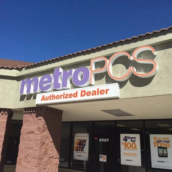
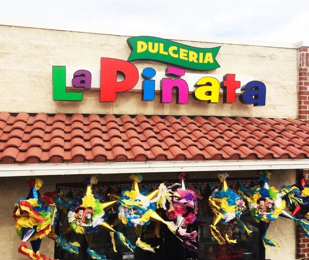
DEPTH IS WHAT MAKES A NAME LOOK PERMANENT.
Printed lettering reads as temporary because it lies flat against the surface. A dimensional letter stands off the wall, catches the sun at an angle, and throws a shadow that changes through the day. That movement is why an office lobby with routed metal letters feels established while the same logo on vinyl feels provisional.
Getting that effect right depends on thickness, return depth, standoff distance, and how cleanly the edges are finished. We specify all four before cutting, because a letter mounted flush loses the entire point.
- Aluminum, acrylic, PVC, and composite letters
- Brushed, painted, and polished finishes
- Pattern-mounted for exact alignment
- Interior and exterior applications
Smoother Daily Operation
A door sized and hung correctly opens and closes without sticking, dragging, or requiring a shoulder to shut. We confirm dimensions and swing direction before ordering so the finished door operates the way it should from day one.
DIMENSIONAL SIGNS
THE DETAIL PEOPLE FEEL WITHOUT NOTICING IT.
Nobody walks past a reception wall and thinks about return depth. They just register that the space looks considered. That reaction comes from decisions made in the shop: a half-inch standoff instead of a flush mount, a satin finish instead of a gloss that fights the overhead lighting, a kerf angle that keeps the edge crisp. We make those calls deliberately, because the difference between adequate and excellent lives entirely in them.
BUILT FOR WALLS ALONG THE WASATCH FRONT.
Utah sun is hard on exterior lettering. Ultraviolet exposure fades pigment, freeze and thaw cycles work at adhesive bonds, and wind-driven grit dulls a soft finish within a couple of seasons. Our exterior letters are cut from marine-grade aluminum or thick acrylic, finished with automotive-quality coatings, and mechanically anchored rather than glued, so the wall holds them through everything the valley delivers.
STRAIGHT LINES ARE A HABIT, NOT AN ACCIDENT.
Alignment is the thing clients notice when it is wrong and never mention when it is right. Since 1999 our crews have used full-size paper patterns, laser levels, and drilled templates on every dimensional install, because a baseline that drifts by half an inch across a 20-foot run is visible from the parking lot. That discipline is unglamorous and it is the reason our work photographs well. Where would yours go?
WHAT RAISED LETTERING DELIVERS
PRESENCE WITHOUT POWER
Depth creates impact using shadow rather than electricity, so the sign carries weight all day with nothing to wire, no meter reading, and no lamp to replace later.
A FINISH THAT SIGNALS QUALITY
Brushed metal and hand-polished edges communicate care long before anyone reads the words. Visitors form a judgment about the business from that surface within seconds of arriving at the door.
VERY LITTLE TO MAINTAIN
With no lamps, drivers, or seals to fail, upkeep amounts to an occasional wash. Solid letters stay looking new through years of weather with almost no attention required.
READS CLEANLY IN PHOTOGRAPHS
Depth gives cameras something to catch, so your frontage looks sharp in listings, reviews, and social posts. Flat vinyl tends to disappear into the wall in the same shot.
SUITED TO STRICT SIGN CODES
Many districts limit illuminated signage far more tightly than unlit lettering. Dimensional work often clears review in places where a lit cabinet would be refused outright, and saves a round of revisions.
EASY TO EXTEND LATER
Adding a tagline, a suite number, or a second logo later is straightforward when the original was cut from a documented pattern. New pieces match the existing run exactly.
WHAT WE FABRICATE
OUR DIMENSIONAL SIGN WORK.
Raised lettering covers everything from a single routed logo behind a reception desk to a full building identification package. These are the constructions we produce most often, each cut and finished in our own shop.
CUT METAL
Cut Metal Letters
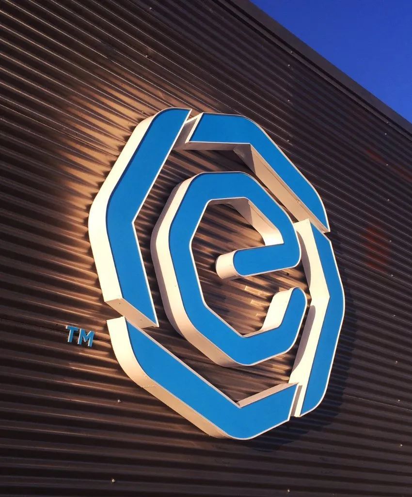
Aluminum and stainless are waterjet or router cut from solid stock, then deburred and finished. The result is a single-piece letter with no seams, suited to exterior walls where longevity matters more than anything.
CLEAN EDGES
Acrylic Letters and Logos
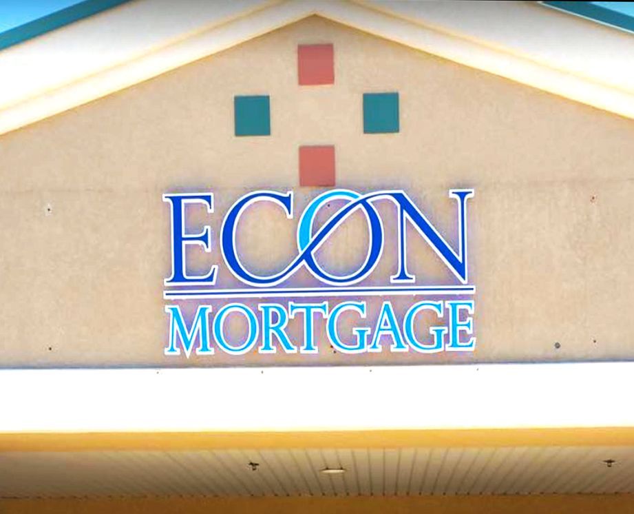
Cast acrylic polishes to a glass-like edge that catches ambient light beautifully indoors. Colors are integral to the sheet rather than painted on, so the finish never chips or fades along a scratch.
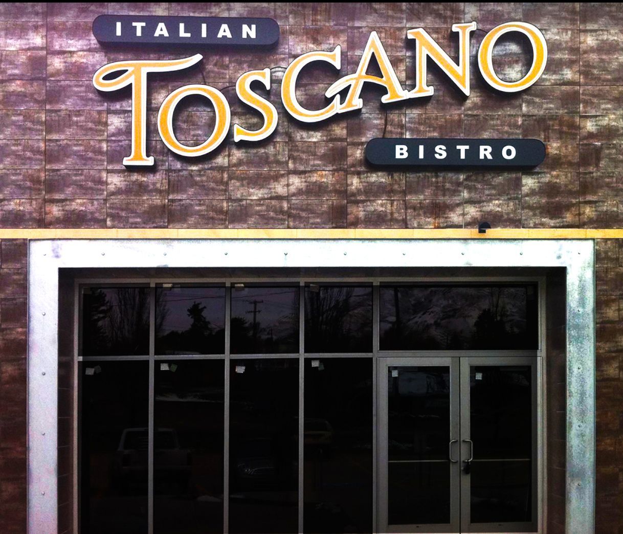
LIGHTWEIGHT DEPTH
Foam and PVC Lettering
Where thickness matters more than mass, high-density foam and expanded PVC give deep letters that mount to almost any interior surface. Hard-coated faces take paint well and suit large lettering runs.
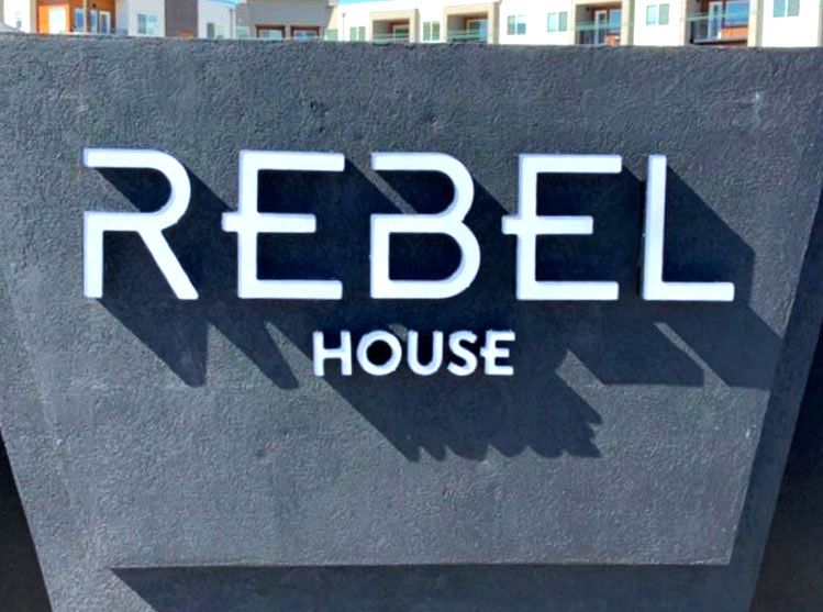
BACKLIT GLOW
Reverse Halo Lit Letters
Fabricated metal faces with open backs push LED light onto the wall behind them, outlining each character in a soft glow. The look suits hotels, law offices, and lobbies where restraint reads as confidence.

SINGLE PIECE
Raised Logo Plaques
Complex marks with fine detail work better as one routed panel than as separate elements. The whole logo is cut, layered, and finished as a unit, then mounted with concealed studs for a floating effect.
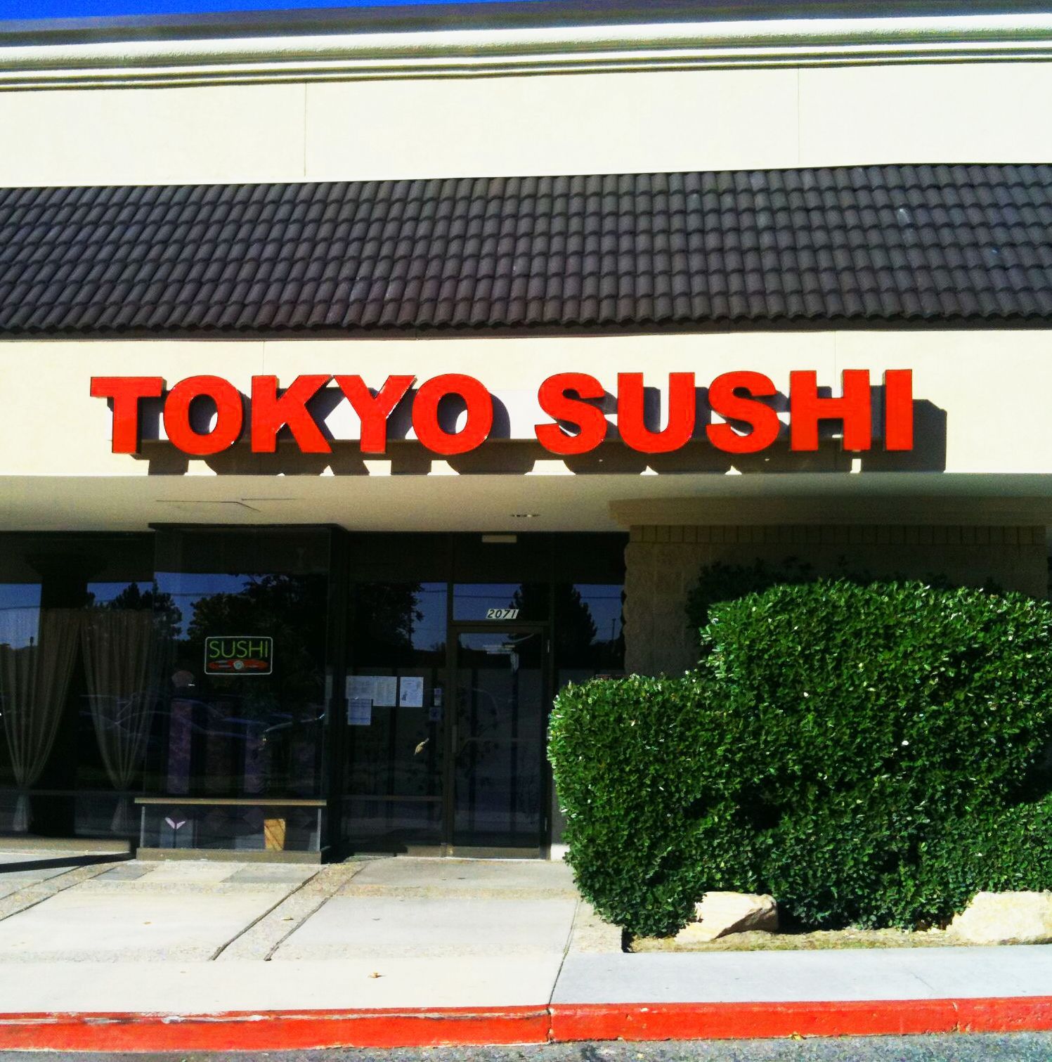
BUILDING SCALE
Architectural Building Letters
Large-format lettering for parapets, canopies, and monument walls is engineered for wind load and anchored into structure rather than skin. Sizes run from a few inches to several feet per character.
Duis aute irure dolor in reprehenderit in voluptate velit esse cillum dolore eu fugiat nulla pariatur. Excepteur sint occaecat cupidatat non proident, sunt in culpa qui officia deserunt mollit anim id est laborum.
Lorem ipsum dolor sit amet
★★★★★
Mike T.
THE WORD ON OUR WORK
WHAT OUR CLIENTS SAY.
The comment we hear most about dimensional work is that it looks better in person than in the rendering. Architects and property managers across the valley tend to notice the edge finish first, then the alignment, which are exactly the two things worth judging.
Common Questions
frequently asked
questions.
Raised lettering raises questions about material, thickness, and mounting that flat signage never does. These are the ones clients ask before committing to a dimensional package for their building.
What are dimensional letters made from?
Aluminum, stainless steel, cast acrylic, expanded PVC, and high-density foam cover almost every application. Exterior work leans toward metal and thick acrylic, while interiors open up to lighter materials that mount easily to drywall or panel.
How thick should dimensional letters be?
Thickness scales with letter height and viewing distance. Interior lettering under 12 inches tall usually reads well at a quarter to half an inch, while building letters several feet tall need 2 inches or more to hold their shadow.
How are dimensional letters attached to a wall?
Studs, pins, or a mounting rail, depending on surface and weight. Threaded studs set into drilled holes give the strongest hold outdoors, while interior letters often mount on concealed pins with a small standoff behind them.
Are dimensional letters suitable for outdoor use?
Provided the material and finish are chosen for it, yes. Aluminum, stainless, and cast acrylic all handle Utah weather well. Foam and standard PVC belong indoors, where no ultraviolet exposure drives moisture into the core.
What is the difference between flat cut and fabricated letters?
Flat cut letters are machined from a single sheet, giving a solid body with uniform thickness. Fabricated letters are built from a face and separate returns welded together, allowing far greater depth and an option for lighting inside.
Can dimensional letters be lit?
They can. Halo lighting is most common, setting LEDs behind the letter to glow against the wall. Front illumination needs fabricated construction with a translucent face. M Graphics & Signs Inc builds both in Salt Lake City, UT.
How do you keep dimensional letters aligned during installation?
A full-size paper pattern goes on the wall first, marking every stud hole and the baseline. Holes are drilled through it, the pattern comes off, and each letter drops onto studs already set in exactly the right place.
Do dimensional signs work well in a lobby or reception area?
They are the standard choice there. A raised logo behind a desk gives the space a finished anchor and photographs cleanly for your website. M Graphics & Signs Inc has installed these across Salt Lake City, UT for 27 years.
Lorem Ipsum has been the industry's standard dummy text ever since the 1500s, when an unknown printer took a galley of type and scrambled it to make a type specimen book. It has survived not only five centuries, but also the leap into electronic typesetting, remaining essentially unchanged.
STEP 03
Lorem Ipsum is simply dummy text.
Lorem Ipsum has been the industry's standard dummy text ever since the 1500s, when an unknown printer took a galley of type and scrambled it to make a type specimen book. It has survived not only five centuries, but also the leap into electronic typesetting, remaining essentially unchanged.
STEP 06
Lorem Ipsum is simply dummy text.
HOW WE WORK
FROM SHEET STOCK TO FINISHED WALL, HERE IS HOW.
STEP 01
Set The Layout And Scale
Working from your artwork, we lay the wording out at full size against a photograph of the wall, checking cap height, letter spacing, and how the run sits against windows, joints, and edges.
STEP 02
Choose Material And Finish
Samples come to the table so you can see brushed aluminum next to polished acrylic under the light that will actually surround the sign. That comparison settles most decisions in a single meeting.
STEP 03
Cut The Letters
Router and waterjet paths are programmed from the approved vector file, then each character is cut from solid stock. Tight tolerances at this stage are what make the finished spacing look effortless later.
STEP 04
Finish Every Edge
Cut edges are deburred, sanded, and polished or brushed by hand before any coating goes on. This is slow work and it is the single biggest difference between a good letter and a cheap one.
STEP 05
Build The Mounting Pattern
Stud positions are transferred to a full-size paper template that matches the approved layout exactly. Everything that determines alignment on the wall is decided here, on a bench, rather than on a ladder.
STEP 06
Install And Level
On site, the pattern is leveled and taped up, holes are drilled, and letters are set with adhesive and studs. We check the baseline from across the parking lot and again from the sidewalk before packing up.