Channel Letters vs Cabinet Signs: Which Reads Better From the Road?
August 26, 2026
QUICK ANSWER: Channel letters are individually fabricated letters, each with its own lit face, mounted straight to the wall. A cabinet sign is a single enclosed box with one lit face carrying the whole message. Channel letters read cleaner up close and hold their shape in daylight because each character throws a shadow. Cabinet signs push a larger, brighter glow that carries farther down a fast road and hold more information on one face. The right pick depends on how far away drivers first catch your frontage, how much the sign has to say, and how it has to sit on your building.
A driver on a six-lane arterial has your building in view for a couple of seconds before the next light pulls their eyes away. Inside that window the sign either resolves into a name they can read or smears into the row of frontages beside it. Whether you reach that driver usually traces back to a fabrication decision made months earlier: individual channel letters bolted across the wall, or a single lit cabinet hung above the door.
Both formats light up. Both use aluminum and LEDs. From fifty feet on a clear afternoon they can look like equal choices. The difference shows up at the edges, at three hundred feet, at nine at night in February, and in the third winter after a hard freeze-thaw cycle has worked on the face. This is the comparison of channel letters vs cabinet signs that matters once you stop looking at a showroom photo and start looking at your own frontage and the traffic passing it.
What Channel Letters Actually Are
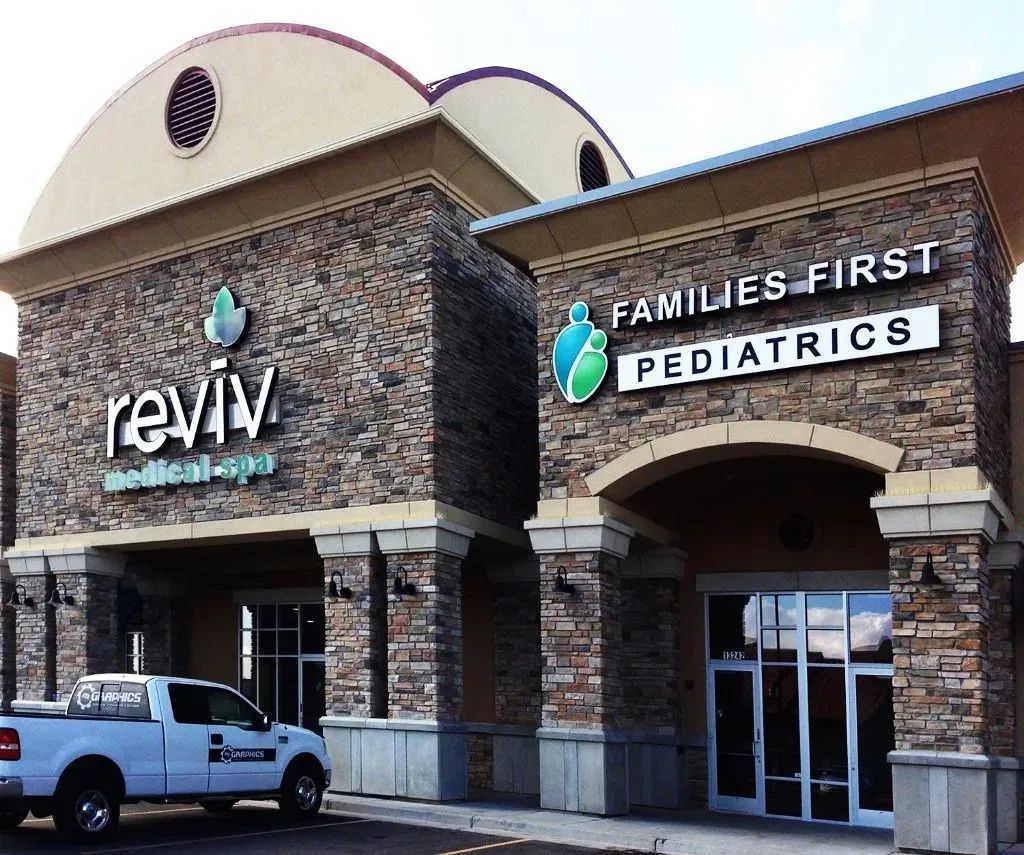
Channel letters are three-dimensional characters, each one built as its own small assembly and mounted to the building face.
Construction
Every letter has an aluminum back and side wall, called the return, with a translucent acrylic face on the front. LED modules sit inside the cavity and light the face from within. Depth typically runs three to five inches, which is what gives the letters their shadow line in daylight.
Mounting
Letters attach either directly to the wall, one at a time, or to a raceway, a shallow metal channel that carries the wiring and lets the whole set install as one unit. Direct mounting looks cleaner on the wall. Raceway mounting keeps the electrical run and penetrations organized behind a single bar.
Lighting Styles
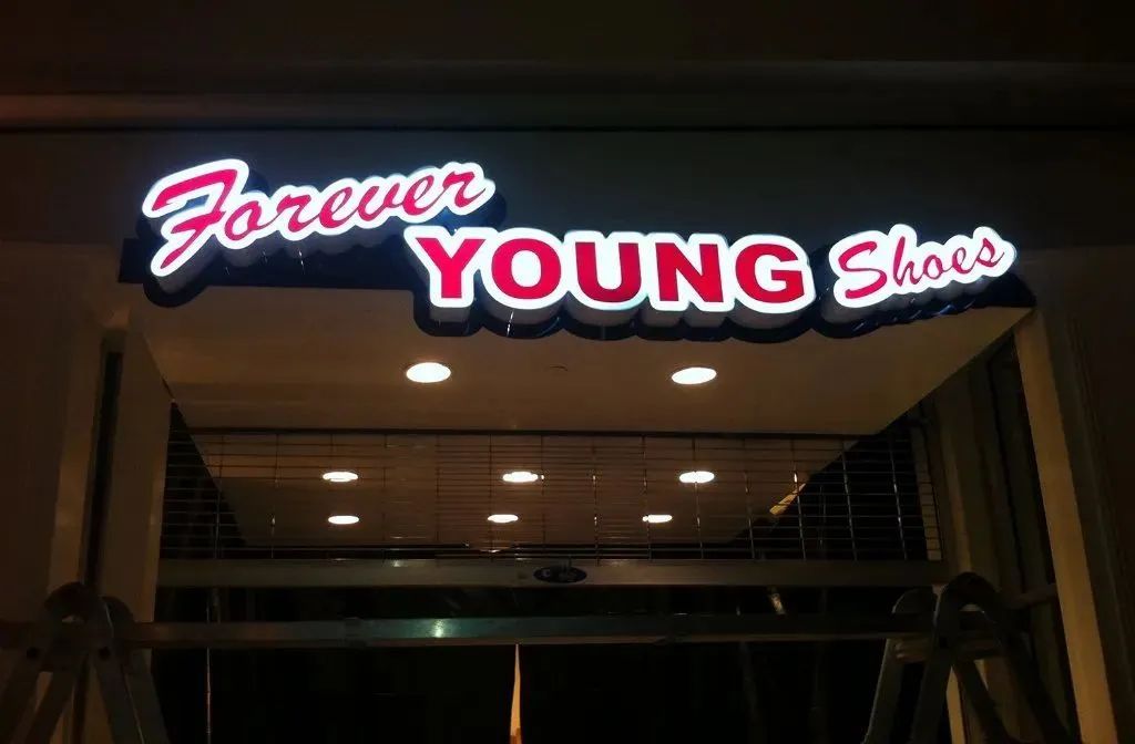
Front-lit is the common choice, with light coming through the acrylic face. Halo-lit reverses it: solid metal letters throw light onto the wall behind them, producing a glowing outline instead of a bright face. Combo-lit does both at once. Each style changes how the wall reads at night, and each suits a different kind of frontage.
Where They Fit
Channel letters carry the brand on the building itself. They work when the name is the identification point, the architecture is worth showing, and customers evaluate the storefront at close to medium range.
What a Cabinet Sign Actually Is
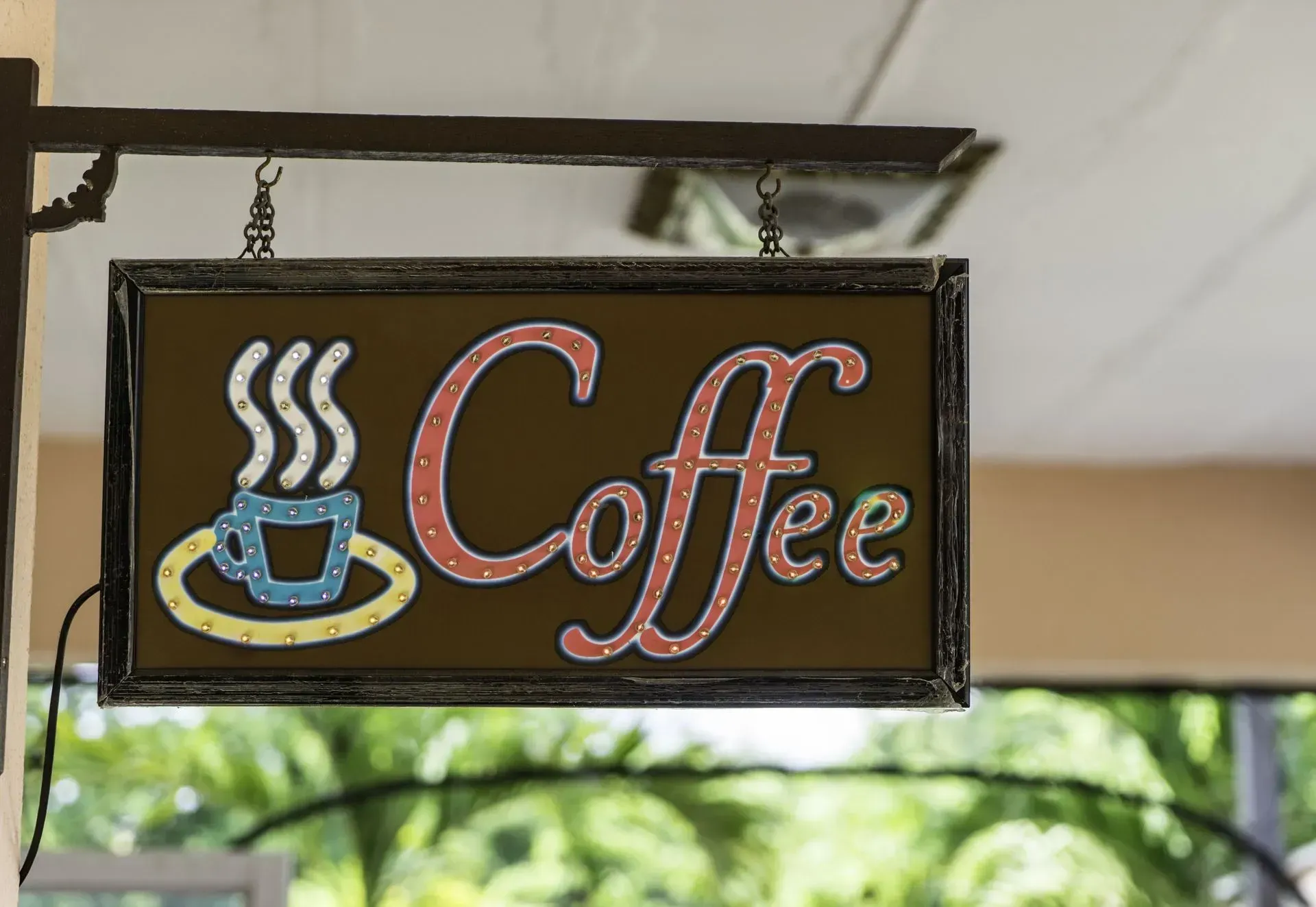
A cabinet sign, sometimes called a box sign or lightbox, puts the whole message on one lit surface inside a sealed enclosure.
Construction
A welded aluminum frame holds a translucent face, usually printed or routed polycarbonate or acrylic. LEDs mounted inside light the entire face evenly. Because the face slides or lifts out, a tenant change or rebrand becomes a face swap rather than a full rebuild.
What It Carries
One continuous panel can hold a logo, several lines of text, full-color graphics, and supporting information that individual letters cannot easily reproduce. If the design is graphic-heavy or the name is long, the cabinet holds it in one clean field.
Where It Mounts
Cabinets hang on the wall or ride on a pole or pylon above the parking and landscaping. Raised on a structure, a cabinet puts the name into the sight line of traffic that would never register letters flat on a distant building.
The tradeoff is dimension. A cabinet is a flat, unified field. It reads as one bright rectangle rather than a set of distinct characters, which is a strength for legibility at distance and a weakness for close-range refinement.
Reading Distance: The Split That Decides Most Jobs
Where your sign lives on the road settles most of the argument.
Daytime
Channel letters win the unlit hours. The three to five inches of depth cast shadows and catch light, so the letters stand off the wall and stay distinct even before anything switches on. A cabinet reads fine in daylight but leans on color and size rather than form.
Close-Range At Night
Channel letters again. Each character glows on its own with clean edges, which reads sharply for shorter names in walkable districts and tight retail rows.
Distance At Night
The cabinet takes it. A fully lit face is a larger, brighter block of light, and past roughly three hundred feet that broad glow carries better than a line of separate letters. On a pylon above a busy corridor, a cabinet is almost always the more legible call.
Under a hundred feet, both formats do the job and the choice comes down to the look you want. It is the far lane and the pole-mounted read where the two genuinely diverge.
TIP: Before you commit to a format, stand at the spot where drivers first see your frontage, not at your front door. The distance and angle from that point, plus whether traffic is moving or stopped, tell you more about letter format than any showroom sample.
How Mountain-West Weather Ages Each One
Signs here live through a punishing cycle: hundred-degree west-facing summer sun, sub-freezing January nights, damp inversion air, and snow load. That cycle is what eventually decides how a sign looks in its second decade.
Face Aging
Acrylic faces on channel letters typically hold their color for fifteen to twenty years before noticeable yellowing. Cabinet faces, carrying a larger continuous span, tend to show yellowing or stress cracking sooner, often in the eight to fifteen year range, and a tired cabinet face is one large panel to replace rather than a single letter.
Seals And Electrical
Temperature swing and moisture are where illuminated signs fail. Penetrations that are not sealed, and power supplies mounted where heat cannot escape, put stress on drivers and connections. Sealed housings and properly placed supplies are what keep both formats running through the months when evening trade depends on being seen.
Repair Economics In Practice
A dead module in one channel letter is a single-letter fix, and the rest of the set stays lit and untouched. A failed LED array or a cracked face on a cabinet is usually a whole-panel job. Neither is fragile when built well, but the way each ages and gets serviced is different, and that difference compounds over fifteen years on a Salt Lake County frontage.
Illumination and Even Light
Good lighting on either format is even light. Bad lighting announces itself.
Hot Spots And Dark Corners
These come from LED modules spaced wrong for the depth of the letter or cabinet. Modules have to be laid out to the cavity depth, lens angles chosen for the face material, and color temperature matched to the surrounding lighting, or the sign reads as a grid of bulbs behind plastic instead of one clean surface.
Component Life
LED modules generally run fifty thousand to one hundred thousand hours, which is many years of dusk-to-close use. Power supplies are the shorter-lived part, commonly eight to twelve years, and they are a serviceable component rather than a reason to replace the sign.
Energy Behavior
Channel letters light only the shape of each character, so they draw less than a cabinet lighting a full face of the same footprint. Over years of evening operation that gap is real, though modern LED cabinets have narrowed it against the older fluorescent boxes they replace.
WARNING: Do not judge a lit sign by a daytime rendering alone. A face that looks even in a drawing can show module shadows or a color temperature that clashes with neighboring frontages once it powers up after dark. Ask to see the format lit at night, on a building, before the design is locked.
Matching the Sign to Your Building and Traffic
Set format aside for a moment and answer four questions about the site.
How far is the first read? Fast corridor or a deep setback pushes toward a cabinet, often pole-mounted. A close, walkable frontage favors channel letters.
How much has to fit? A short, strong name suits channel letters. A long name, a detailed logo, or several lines of information suits a cabinet face.
What does the wall allow? Limited mounting area, awkward architecture, or a preference for few penetrations can make a single cabinet the practical assembly. A clean, prominent wall is where channel letters shine.
Does one sign have to do everything? Often it does not. A common answer is a hybrid: channel letters on the building for the close, branded read, and a cabinet on a pylon for the distance read from the road. Each format does what it does best, and the frontage gets both.
Frequently Asked Questions
Which is better for a business set far back from a busy road?
A cabinet sign, usually raised on a pole or pylon. Its large lit face reads at distance better than individual letters, putting the name into moving traffic's sight line above parked cars and landscaping before drivers pass.
Do channel letters or cabinet signs handle harsh winters better?
Both hold up when built and sealed correctly, but aging differs. Channel letter faces keep color longer, and weather damage usually affects one letter rather than the whole sign. A cabinet's single panel makes a cracked face a larger replacement.
Can I get the dimensional look of channel letters with a cabinet sign?
Only partly. A cabinet face can be pan-formed for gentle relief, but true three-dimensional depth and shadow lines belong to channel letters. If dimensional character matters most to your look, channel letters remain the format that actually delivers it.
Which format is easier to rebrand later?
The cabinet, in most cases. Because the face slides out, a name or graphic change becomes a face swap while structure and wiring stay in place. Changing channel letters usually means refabricating the set, since each one matches specific characters.
Are channel letters worth it for a short business name?
Often yes. Channel letters read cleanest with shorter names, where each glowing character stays distinct up close and in daylight. A short, strong name is close to the ideal case for this particular format and mounting style.
What if I need both close-range branding and long-distance visibility?
That's the classic case for a hybrid setup: channel letters on the building elevation for the near, branded read, paired with a cabinet on a pylon for the far read, together covering a frontage neither handles fully alone.
Choosing the Sign Format That Fits Your Frontage
Channel letters and cabinet signs solve different problems, not competing versions of the same one. A close, walkable storefront wants the dimensional shadow line and clean glow of individual letters. A building set back from a fast corridor needs the broad, bright field a cabinet throws from a pylon. Neither format is the universal right answer, and picking between them without walking the actual sight line from the road is how businesses end up with a sign that looks sharp on paper but disappears at the distance drivers actually see it from.
For 27
years, M Graphics & Signs Inc
has fabricated and installed both formats across Salt Lake City, UT, watching firsthand how each one ages through a mountain-west winter and holds up against a summer of west-facing sun. That kind of repeated exposure to real frontages, not showroom samples, is what turns a format decision into a sign that still reads clean a decade in. Many buildings end up better served by a hybrid than a single choice, and that's usually where the conversation naturally lands.